Decision-Ready Insights. In your hands in days.

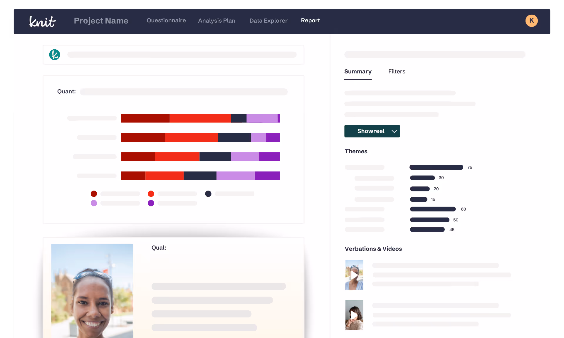
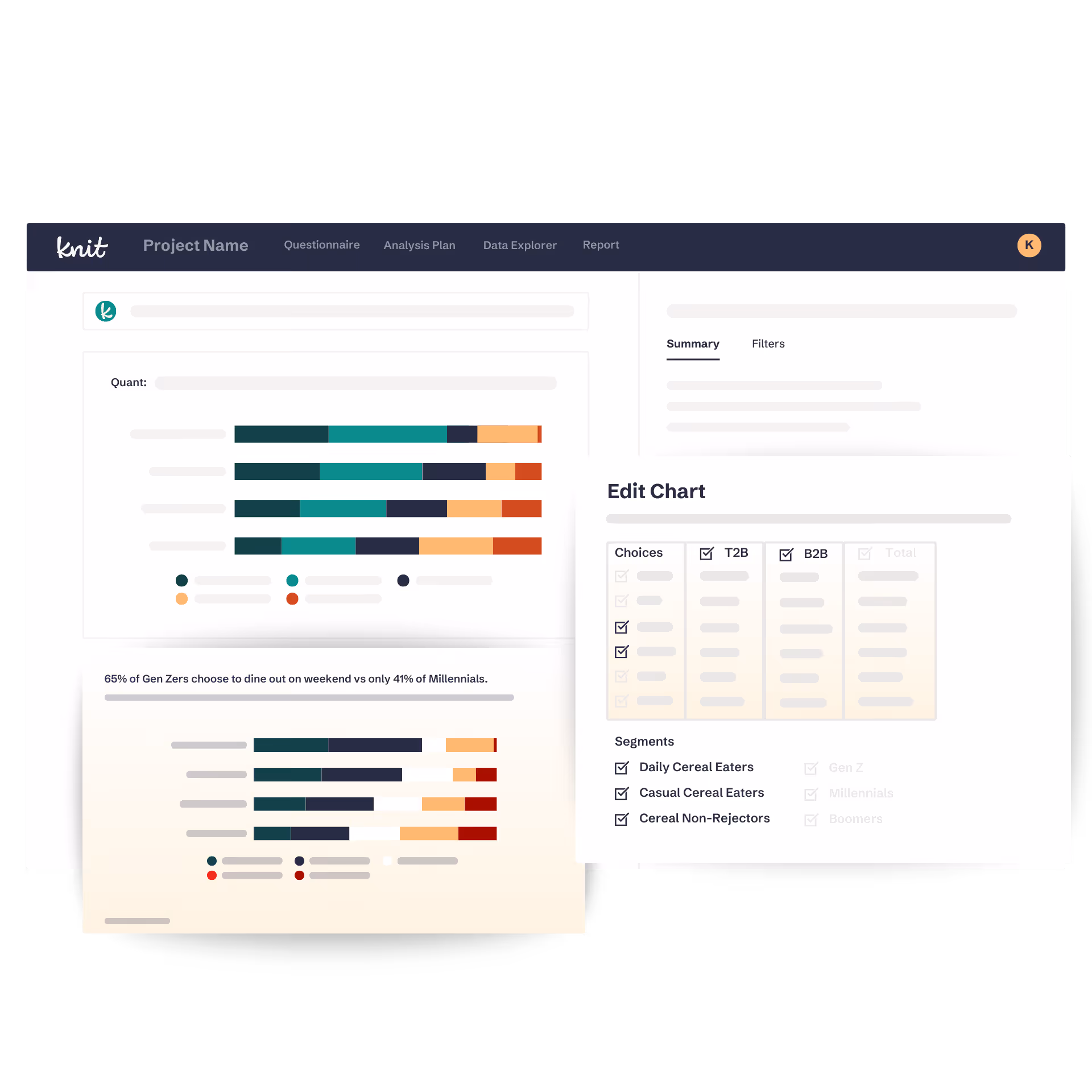
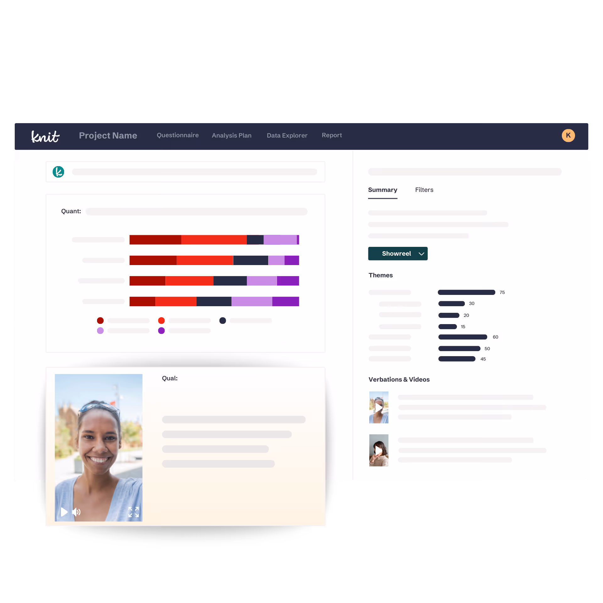
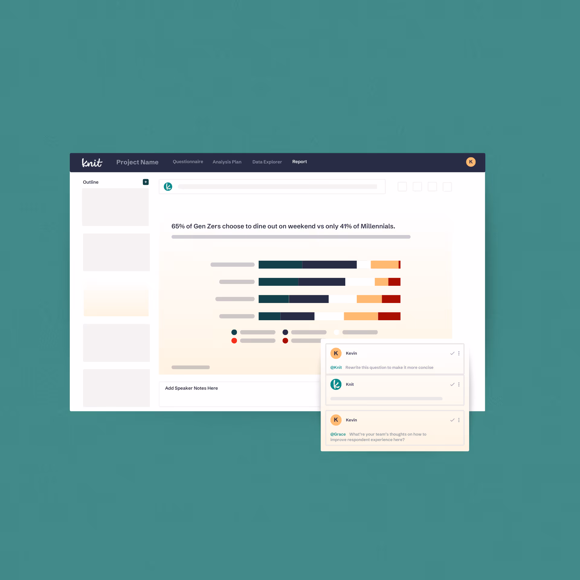
Once fielding wraps, Knit’s AI gets to work across both your quant and qual data simultaneously, guided by your Analysis Plan. From custom cuts to theme tagging, every insight is cited and sourced, so you can stand behind the work without digging through the underlying data yourself (unless you want to).

User interface of Knit AI showing a project report with quantitative bar charts, a smiling woman’s profile photo, theme bar graphs, and video thumbnails with play buttons.
Answering the “what”

Quantitative analysis — the numbers, cut the way you need them

Knit analyzes your quant data across every cohort, cut, and segment you care about — supporting 100+ question types. Guided by your Analysis Plan, every chart and summary can be generated immediately after fielding closes.

Summaries
Cuts & Segments
Statistical Significance
Charts & Crosstabs
Summaries

Knit generates a summary and topline highlight for your quant data — with AI rationale explaining how each finding was reached, so you can inspect and defend the work.

Dashboard interface showing knit AI quant analysis with horizontal bar charts comparing groups and an edit chart panel with choices and segment filters for daily and casual cereal eaters.
Cuts & Segments

Your key cohorts, cuts, and segments are automatically prepped and visualized — no manual setup, no waiting. Dive in the moment your data is ready.

Dashboard interface showing knit AI quant analysis with horizontal bar charts comparing groups and an edit chart panel with choices and segment filters for daily and casual cereal eaters.
Statistical Significance

Knit flags findings with statistical significance so you know which results are meaningful and which aren’t, giving you the confidence to make decisions.

Dashboard interface showing knit AI quant analysis with horizontal bar charts comparing groups and an edit chart panel with choices and segment filters for daily and casual cereal eaters.
Charts & Crosstabs

Every chart and crosstab is built to your research best practices, so the visualization matches how you actually think about and present your data.

Dashboard interface showing knit AI quant analysis with horizontal bar charts comparing groups and an edit chart panel with choices and segment filters for daily and casual cereal eaters.
Dashboard interface showing knit AI quant analysis with horizontal bar charts comparing groups and an edit chart panel with choices and segment filters for daily and casual cereal eaters.Dashboard interface showing knit AI quant analysis with horizontal bar charts comparing groups and an edit chart panel with choices and segment filters for daily and casual cereal eaters.Dashboard interface showing knit AI quant analysis with horizontal bar charts comparing groups and an edit chart panel with choices and segment filters for daily and casual cereal eaters.Dashboard interface showing knit AI quant analysis with horizontal bar charts comparing groups and an edit chart panel with choices and segment filters for daily and casual cereal eaters.Dashboard interface showing knit AI quant analysis with horizontal bar charts comparing groups and an edit chart panel with choices and segment filters for daily and casual cereal eaters.
Dashboard interface showing project data with a horizontal bar chart and a video thumbnail of a smiling woman in a gray top.Dashboard interface showing project data with a horizontal bar chart and a video thumbnail of a smiling woman in a gray top.Dashboard interface showing project data with a horizontal bar chart and a video thumbnail of a smiling woman in a gray top.Dashboard interface showing project data with a horizontal bar chart and a video thumbnail of a smiling woman in a gray top.Dashboard interface showing project data with a horizontal bar chart and a video thumbnail of a smiling woman in a gray top.
Answering the “why”

Qualitative analysis — the story behind the numbers, at scale

Knit analyzes hours of video responses and open-ends in minutes — surfacing themes, subthemes, and the human context behind your quant findings. Qual at scale, without the manual lift.

Summaries

Knit generates a summary and topline highlight for your qual data, with rationale explaining what the AI found and why it matters, so every insight is traceable.

Dashboard interface showing project data with a horizontal bar chart and a video thumbnail of a smiling woman in a gray top.
Theme Generation

Knit’s AI Contextual Analysis™ automatically groups your qual responses into themes and subthemes, so patterns surface in minutes, not after days of manual coding.

Dashboard interface showing project data with a horizontal bar chart and a video thumbnail of a smiling woman in a gray top.
Transcripts & Citations

Every qual insight is backed by AI-generated transcripts and direct citations, so you can trace any finding back to the source and share it with confidence.

Dashboard interface showing project data with a horizontal bar chart and a video thumbnail of a smiling woman in a gray top.
Cut by Quant

Filter your qual data by quant responses to tap into the true power of combined quant + qual. Segment video and open-end feedback by any quant variable to get the “what” and “why” in a single view.

Dashboard interface showing project data with a horizontal bar chart and a video thumbnail of a smiling woman in a gray top.
Summaries
Theme Generation
Transcripts & Citations
Cut by Quant
Go deeper

More ways to get to the insight that matters

Every study comes with tools to go beyond the surface — whether you want to explore the data yourself, ask follow-up questions, or bring in data you already have.

Analysis Plan

Before analysis begins, Knit generates a custom Analysis Plan — outlining the cohorts, cuts, and directives that guide what gets surfaced in your report. Direction built in from the start.

Drill-Down

Want to explore beyond what Knit surfaced? Dive into the Data Explorer and uncover new quant or qual insights on your own terms, always just a click away.

Ask Knit

Ask any follow-up question about your data and get a complete answer — headline, visualization, summary, and rationale — in minutes. 

Data Upload

Already sitting on survey data that hasn’t been analyzed? Upload quant responses or open-ends directly into Knit and get decision-ready insights in minutes — no re-fielding required.

How NASCAR leverages fan and non-fan insights to optimize its in-season tournament launch strategy

Learn how NASCAR gathered, cut, and analyzed fan and non-fan input at scale to guide its in-season tournament launch strategy with the help of Knit.

White curving abstract line with a loop on a black background.
Illustration of a green fiber optic cable with glowing tips on a black background.Abstract black and white textured pattern with gradient shading and noise effect.
Knit Researcher and Insights Professional Book Demo

Book a demo

See how Knit turns fielded data into a story, with quant and qual in a single study.
Submit the form. Grab some time. Let’s chat!