Knit Platform Updates in August 2025
September 22, 2025
Our latest August release gives you the ability to get your reports closer to stakeholder-ready, faster than ever. You can now upload images to slides, export to Google Slides, and more.

September 22, 2025
Our latest August release gives you the ability to get your reports closer to stakeholder-ready, faster than ever. You can now upload images to slides, export to Google Slides, and more.
At Knit, we’re continuing to evolve our Researcher-Driven AI platform to make storytelling easier, faster, and more impactful. Our newest features deliver even more flexibility, automation, and intelligence—helping you share insights with polish and precision.

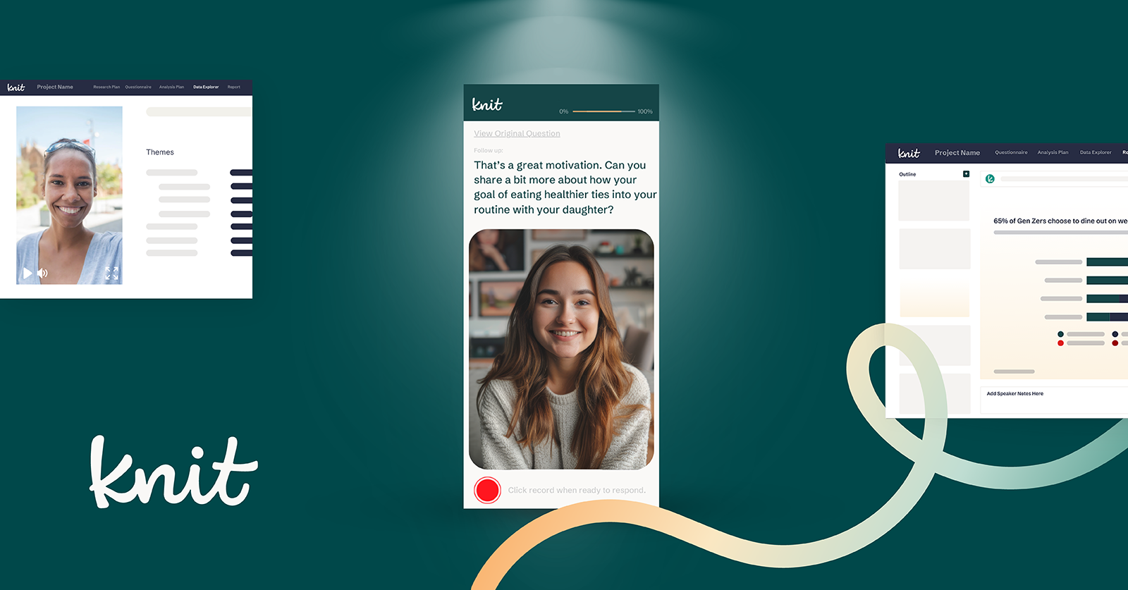
Bring your insights to life with visual storytelling
You can now upload and edit images directly on any slide inside your Knit report—ideal for showcasing new products, concepts, mood boards, and more—or to add visual context to your key takeaways.
Why it matters: Including imagery makes your story more engaging and can illustrate a point far better than words alone—especially in concept testing and intro slides.

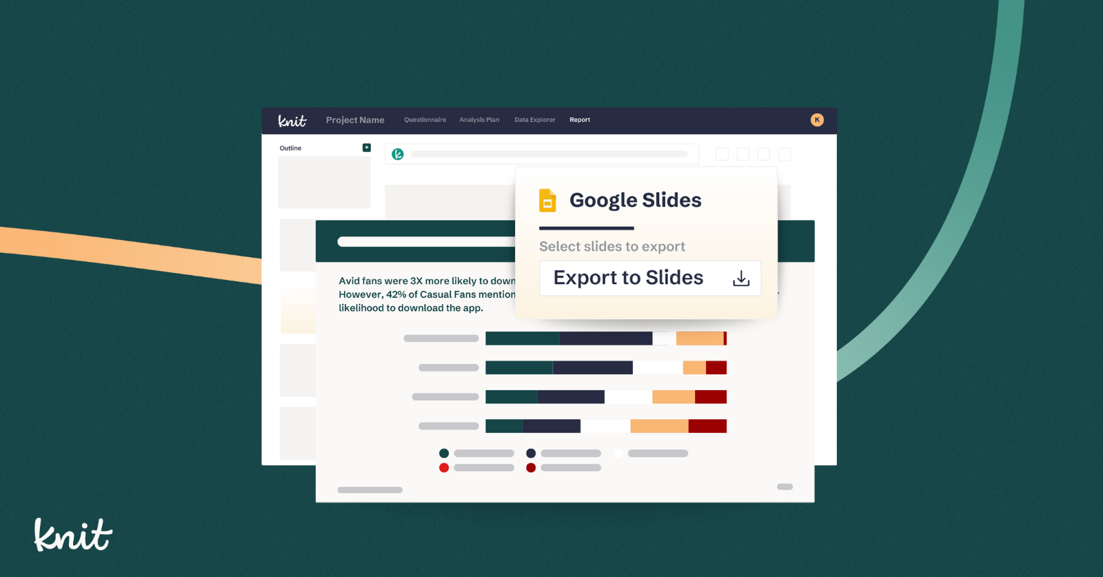
Export reports in Google Slides format—instantly
In addition to PowerPoint, you can now export reports as fully editable Google Slides.
Why it matters: This new export capability makes it easier to collaborate, customize, and share insights in the tools your stakeholders already use.
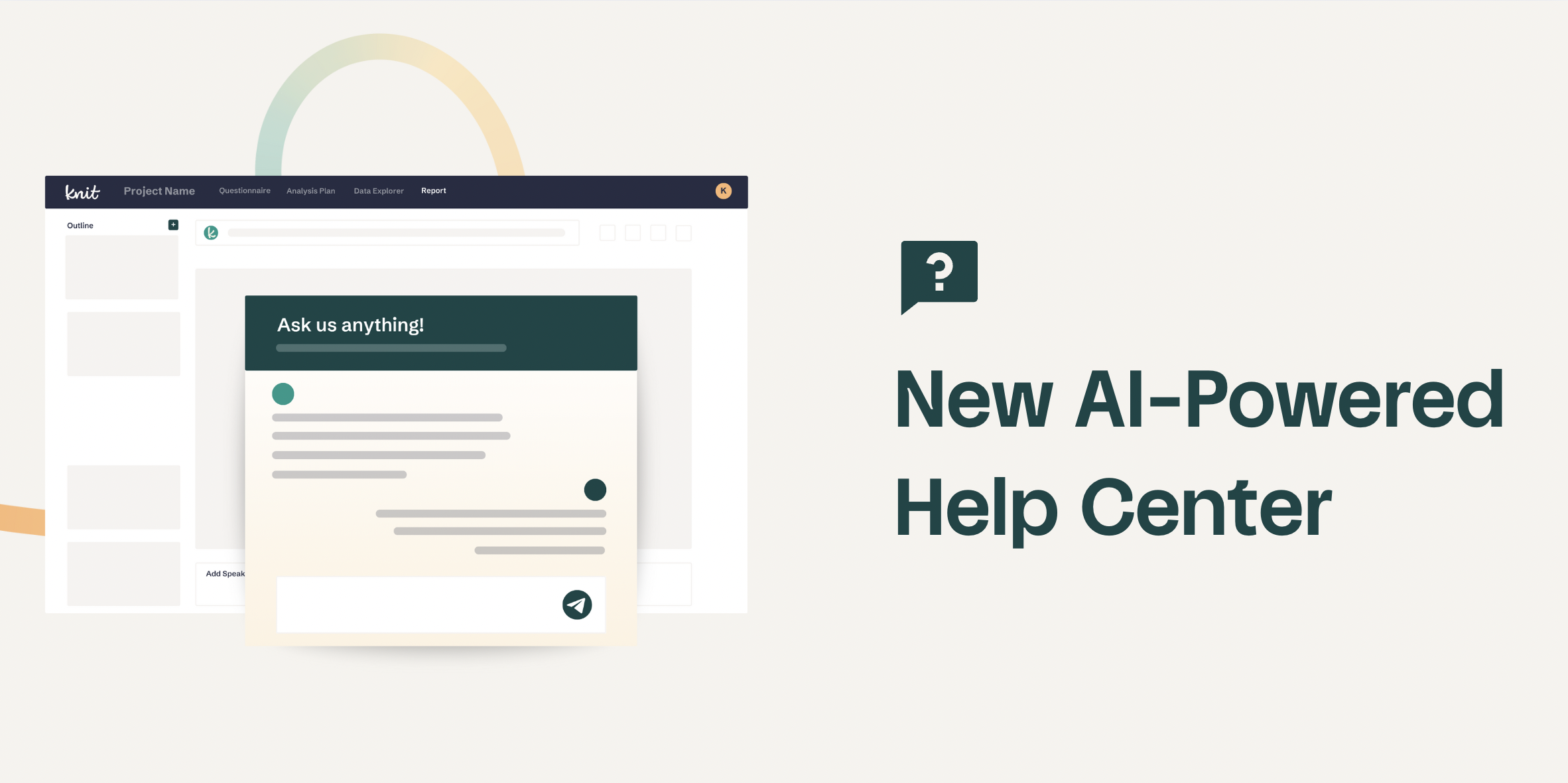
Self-serve support and instant answers, 24/7
We’ve launched a full knowledge base with built-in AI chat support to help you troubleshoot, learn, and explore Knit’s features faster.
Why it matters: Whether you're exploring a new feature, troubleshooting a question, or ramping up a new team member, this new capability ensures you can get what you need without waiting.
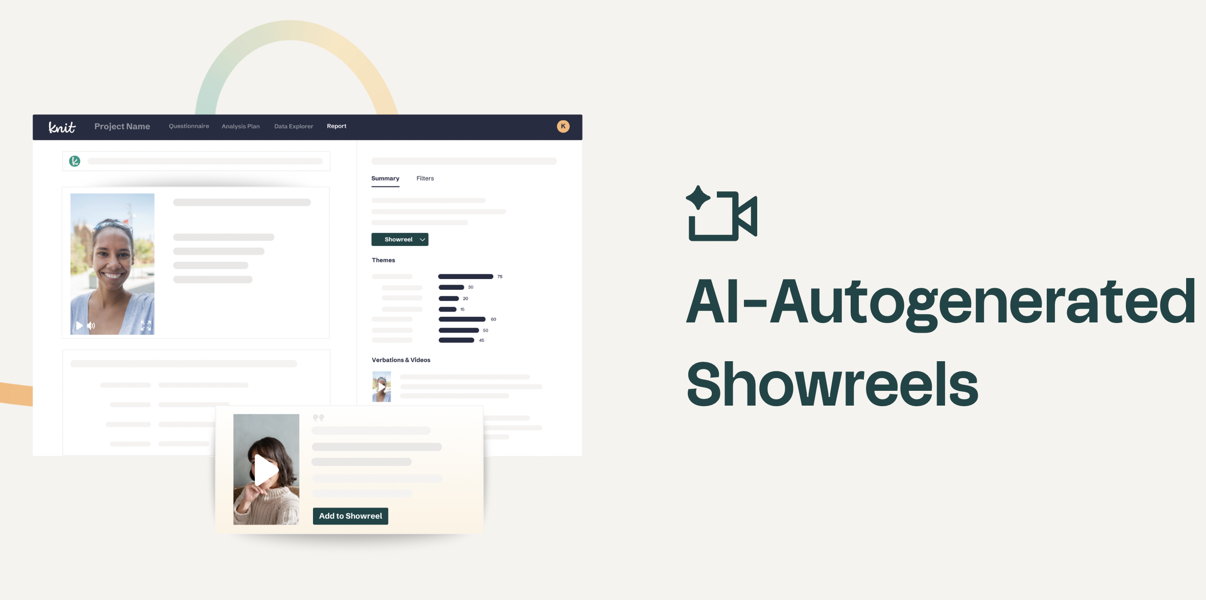
Save hours building showreels—let AI do the heavy lifting
Knit’s AI now auto-generates showreels using your video data, selecting the most relevant responses to spotlight your findings.
Of course, this is just a starting point—you’ll still be able to manually add, edit or update the AI-generated showreels as you see fit.
Why it matters: Showreels are one of the most powerful ways to bring voice-of-customer insights to life. This long-requested feature now elevates how you communicate insights within seconds.
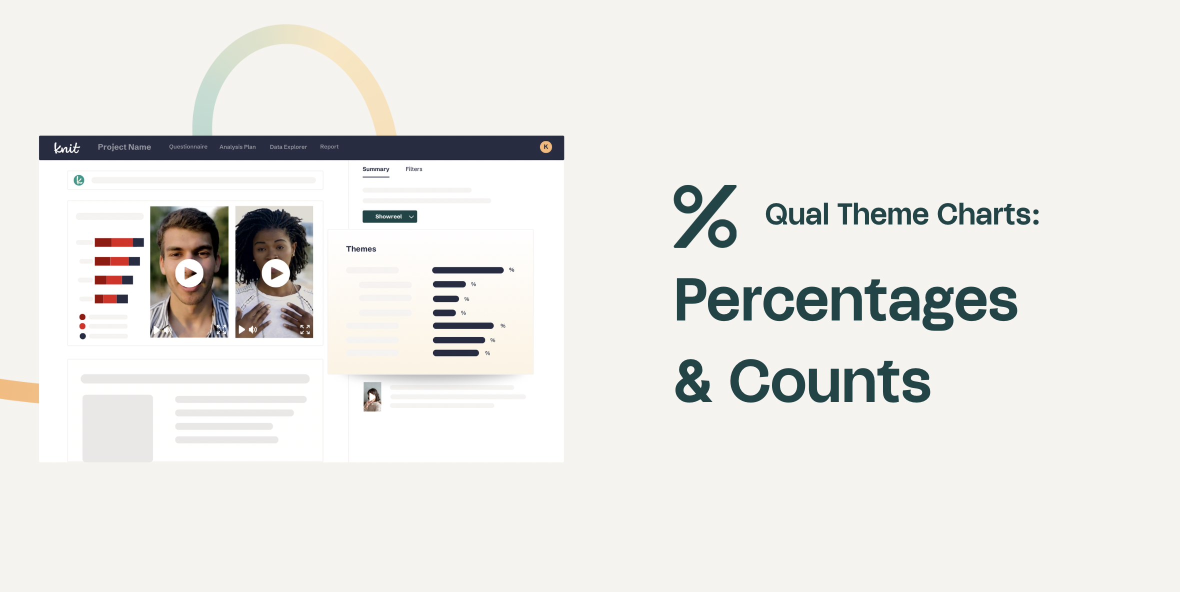
Tailor theme charts to your study’s needs
You can now toggle between counts and percentages in qualitative theme charts—offering greater flexibility depending on what best conveys your findings.
Why it matters: Some studies are better understood as share-of-voice vs. raw volume. This new flexibility ensures you can always present your data the way your stakeholders need to see it.
Want to see what AI-Powered Quant + Qual looks like in action? Book a demo of Knit's end-to-end AI Insights Platform today.